Cases
NIBC Anniversary logo
Client
NIBC is an enterprising bank that assists its customers at the most decisive moments for them. It is a bank that always thinks in terms of solutions with its so-called "THINK YES" mentality.
The bank is located in The Hague, Frankfurt, London and Brussels. From these cities it serves more than 600 medium-sized companies and more than 400,000 retail customers with customer-oriented products and services.
Result
A festive anniversary logo for NIBC to make it clear for a year that the bank is celebrating its 75th anniversary. And matching stamp that can be used in addition to the existing logo. In a clear branding guide, TALK ABOUT has clearly described the guidelines for the use of the anniversary logo and stamp, as well as a description of the fonts and colors.
NIBC 75 years! – From the autumn of 2020, NIBC will be celebrating its 75th anniversary for a year. The bank was founded in 1945 to finance the reconstruction of the Netherlands and since 2008 NIBC has also offered mortgages and savings. In order to pay sufficient attention to this milestone, we were asked to develop a festive anniversary logo together with NIBC.
Targets
The briefing was short but sweet. NIBC wanted a recognizable logo, in which the current logo remained intact as much as possible. In addition, it had to have a festive, stylish look. In addition, NIBC wanted the bank’s strong foundation and innovative character (a fresh look at the future) to be reflected in the anniversary logo. Finally, it had to become a logo that could be used both in the Netherlands and abroad.
Approach
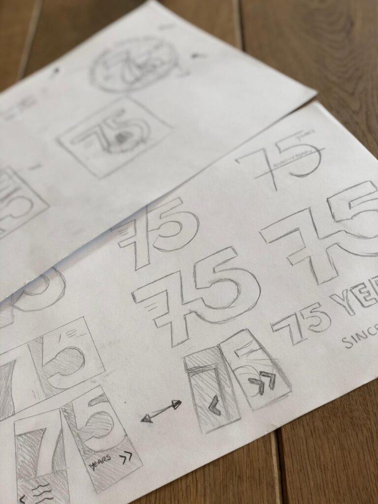
We started brainstorming and getting inspired. What fits with a 75th anniversary and what fits with this sofa? With this collection of ideas we started the sketch phase and many different variants have been developed. From safe, to out-of-the-box and something completely different from the current shape and style. In this way it became clear which style was appreciated by our customer and which was not. Ultimately, a number of sketches were developed into proposals and NIBC made a choice. This proposal has been elaborated in a final design.
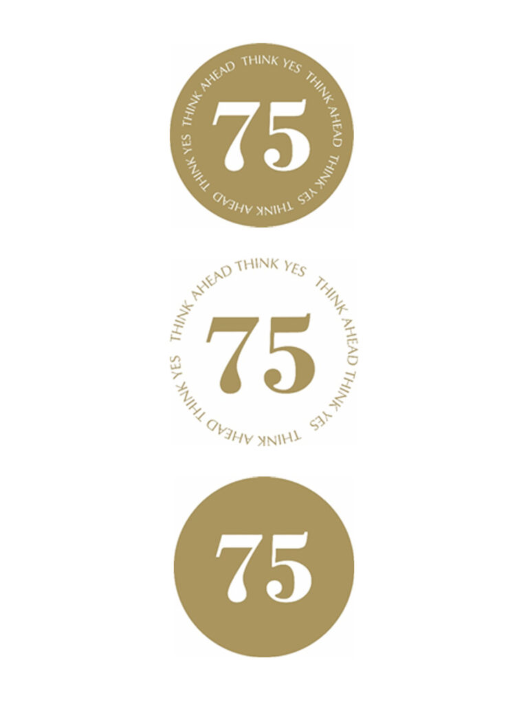
Logo 75 years
Recognizable and festive. In summary, that is the result of the 75th anniversary logo. Indispensable is the 75 years in the logo, which logically clearly indicates how many years the anniversary revolves. It has been deliberately chosen to omit years or “years” in the logo; the big golden 75 tells the story enough. Because gold is both stylish and sparkling, this color has been chosen; it fits well with the festive character of the anniversary.
In addition to the element “75”, a pay-off is also part of the anniversary logo. NIBC is a bank that looks ahead, is fresh and modern. The bank is characterized by its innovative solution-oriented character; the “THINK YES” mindset. This made us think about adding a pay-off to the logo that reflects the NIBC mentality, but also referred to the 75th anniversary. The result: “THINK AHEAD THINK YES” in the festive color gold. This all-encompassing pay-off makes NIBC’s thinking and acting come back! That has brought them to where they are now and where they can look back with pride.
Gold-colored stamp
During the development of the logo, the idea arose to make a “stamp”. An extra anniversary message that can be used in addition to or instead of the anniversary logo on various means such as on printed matter, in a presentation or in a banner for online communications. This allows the organization to make the ‘branding’ of the anniversary even more complete. Three variants have been realized that can be used during the anniversary year with existing or new resources. In this way, NIBC can really show everywhere that it is celebrating its 75th anniversary!
Beelden

Onze klanten